01. Overview
Although I was actively looking for leadership roles at this point in my career, this was an opportunity too rare to come by and too sweet to pass up.This case study shares how I worked closely with some of the smartest researchers and engineers in the industry ( read world ) to turn complex generative-AI technology into a clean, intuitive desktop application.
02. Role
To support a fast-moving AI asset-generation workflow, I built a scalable design system tailored specifically for a high-performance desktop environment. The goal was to create a visual and interaction language that allowed researchers, engineers, and creatives to work seamlessly within a complex toolset—without sacrificing clarity, speed, or usability.
To sum it up -
I collaborated closely with product, research, and engineering to identify common patterns across model configuration, asset browsing, batch processing, and real-time output review. From this, I defined a unified component library optimized for dense, information-rich screens: modular panels, adaptive grids, high-contrast visual hierarchies, and a structured token system for color, spacing, and motion.
The system enabled us to maintain consistency across dozens of experimental features, accelerate prototyping, and ensure that new workflows fit naturally into the product.

Define
I start by aligning designers, researchers, and product stakeholders around the product vision, success metrics, and constraints.
I run kickoff workshops to define user segments, primary use-cases, and the north-star workflow we’re targeting for our first milestone.
Researchers validate these assumptions early through quick interviews and usage studies so the team knows exactly which problems create the most friction for users today.
Build
To ensure we focus on the most impactful features, I introduce a simple, transparent system such as RICE, MoSCoW, or a Problem Impact vs. Engineering Effort matrix.
This helps the team:
Compare features objectively
Surface non-negotiables for V1
Balance usability needs with technical feasibility
Understand where experimentation adds value and where it introduces noise
From this, we define:
Core V1 features (critical path to value—e.g., prompt input, preview, edit, export)
Enhancers (quality-of-life improvements)
Experiments (high-potential but unvalidated ideas)


Ultimate control over your scene


The Creation module
Whether you have an idea or not, that should not stop a user from starting the creation process. We made sure that every user is empowered to try out our features, via their own creativity or through generated context.
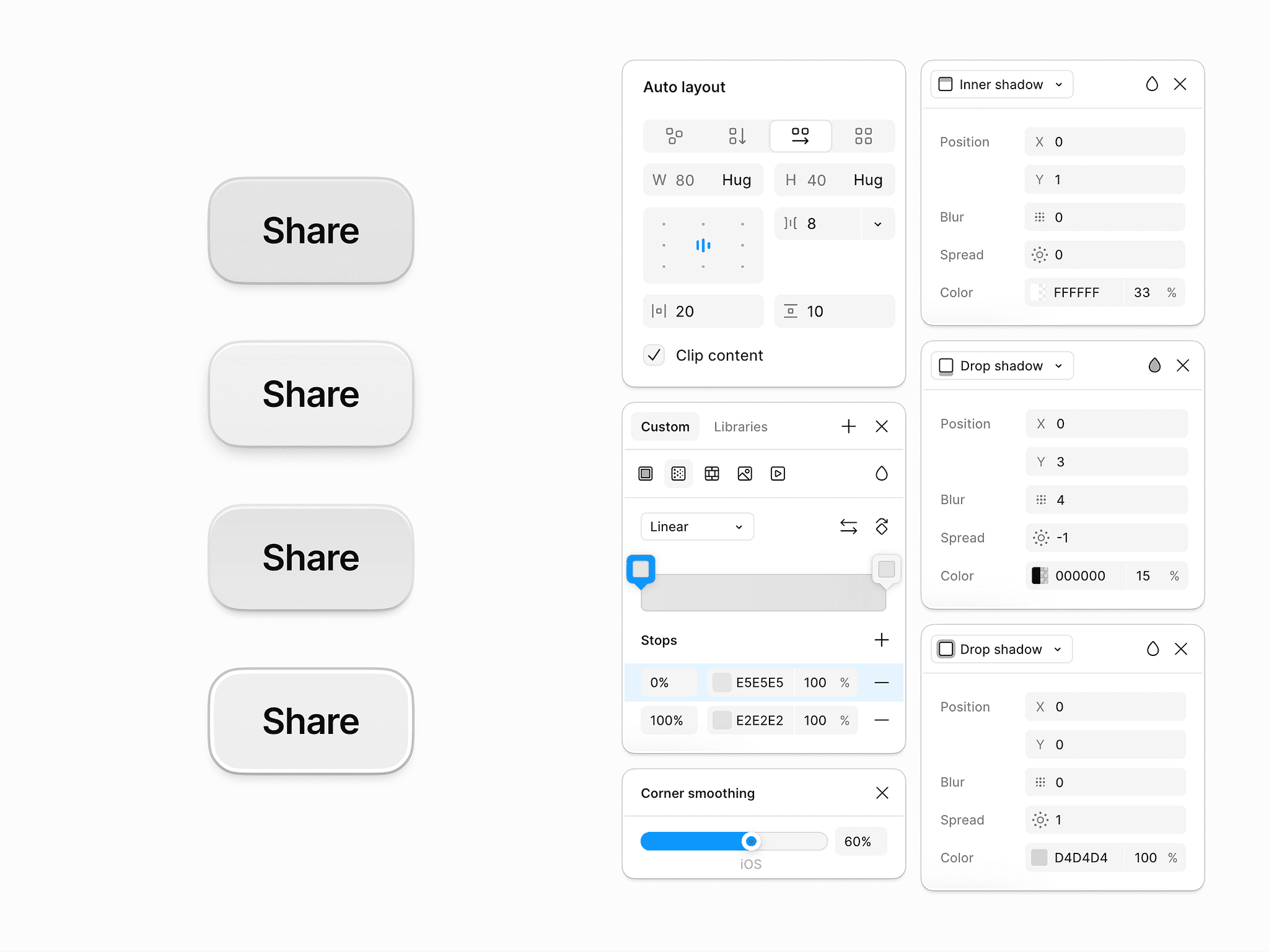
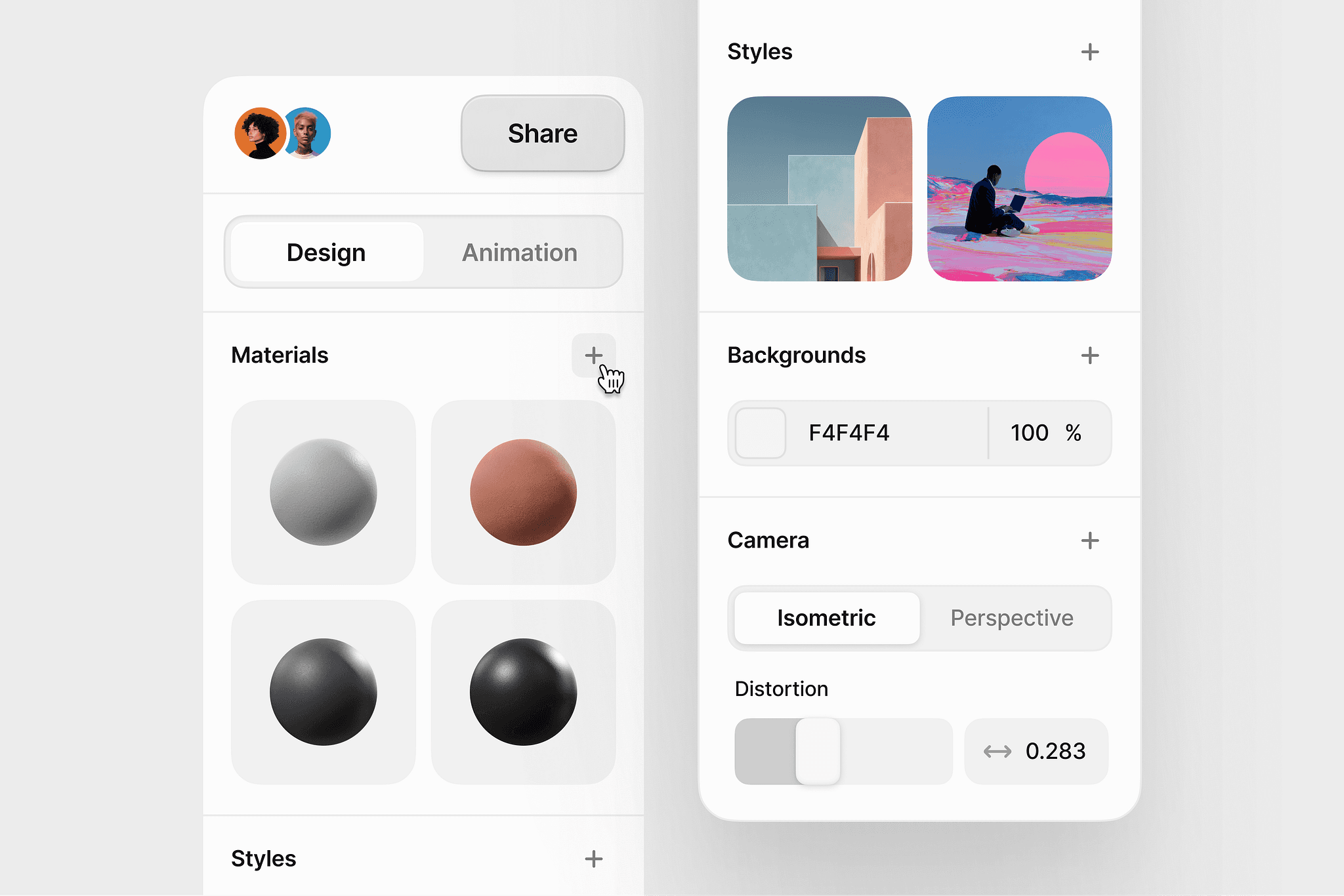
The Customisation module
Heavily inspired by figma and photoshop, we gave the users the ability to tweak and fine-tune every aspect of their creation, including shadows, corners, layouts, colour correction and much more.

The Visualisation module
Another one of our 'standout features' - Once you create an object using the AI generation method you can then tweak the material of the object in a separate component. Users don't have to specify materials when creating, but are free to experiment with it in the fine-tuning workflow. " Make me a chair " then experimenting with materials like iron, feathers or wood is more powerful than " Make me a wooden chair " essentially.

The Options module
The option to have your dashboard behave the way you want is another feature we saw noone else doing and decided to implement. We believe creativity is improved / hindered based on your mental state so the ability to have your dashboard auto-play videos or auto-prompting / sentence completion while creating are ' makers or breakers ' when you're stuck in a creative loop.
Impact on MRR
Impact on Retention
Impact on Onboarding
1. Learning how to design for unpredictability
AI systems are inherently probabilistic—outputs vary, models behave differently, and generation times fluctuate.
A key learning moment was realizing that UX must create predictability when the system itself cannot.
This meant designing clearer feedback loops, progress states, model transparency, and recovery paths so users always understood what’s happening and why.
2. Understanding the importance of designing for power users, not just new users
Working with artists, animators, and designers taught me that professionals have very different expectations from casual users.
A major learning was that power users value:
keyboard-driven speed
density over simplicity
predictable workflows
batch actions
customization
This shifted my design philosophy from “make it simple” to “make it efficient and ergonomic for experts.”
3. Learning to balance innovation with consistency
AI companies ship experimental features constantly.
One of the biggest learnings was that rapid innovation can destroy product coherence if not governed.
This taught me to:
separate experimental vs. stable components
define graduation criteria
protect the core experience while enabling exploration
This balance made the product feel both cutting-edge and reliable.
5. Learning that documentation is a product, not an afterthought
Building the design system showed me that documentation is what actually scales the team, not just components.
A big learning moment was seeing how:
better docs reduced onboarding time
clearer specs cut implementation mistakes
structured guidelines stopped design drift
This reinforced that a design system is only as good as its documentation.
6. Seeing how UX directly drives revenue
In an AI product, better workflows = more generations = more credit consumption.
This created a major learning moment:
UX isn't just aesthetic—it directly influences retention and MRR.
By improving prompting clarity, reducing failed generations, and streamlining exports, we literally increased revenue.
This changed how I framed UX decisions to leadership: in terms of business value, not pixels.